Blog » Making Grass
Making Grass
Initial idea: a sandbox for bots
There is a fascinating story of Rog-O-Matic, a bot written to play (and win!) Rogue. It evolved along with the game. I can't find the source for that, but I remember reading that in every new version, the Rogue authors tried to include a feature that broke Rog-O-Matic – and then Rog-O-Matic authors tried to keep up.
There are other projects like that. Famously, Angband has its Angband Borg, which also serves as an automated test of sorts, and can be even used as a screensaver. There are also many projects for NetHack. I think the concept is really interesting: you have a bot trying to play a game that is pretty difficult for humans, and involves imperfect information and a lot of risk assessment.
So I thought, maybe I could write a "sandbox" roguelike for bots like that? Then I thought that a client-server architecture would be perfect for this: your bot would be a custom-written client that can talk with the server over a specific protocol. The server could be even on another computer.
From there, it kind of naturally evolved into a multiplayer game. Because if you connect one bot, why not connect ten? And why not allow people to play on the server as well? Also, making the game in-browser seemed natural: not only it's a reatively friction-less platform because you don't have to install anything, but also there is already a scripting engine (JavaScript) included, if you want to run your bots.
Not much came out of that idea. I thought a lot about architecture for such a game, about how to make it turn-based but in real time, what should be the communication protocol, and even had some initial ideas of using event sourcing to store the game state as series of updates. I wrote some very early prototypes, but couldn't bring myself to follow through on any of them. My ideas for architecture didn't feel solid enough.
So I set the idea aside and tried to start from the other end. The Front end!
Starting with a mockup
Instead spending a lot of time on backend, and getting to the graphics and UI afterwards, I decided to first draw what my game would look like. I thought it would help me motivate myself if I could already see the game in some shape.
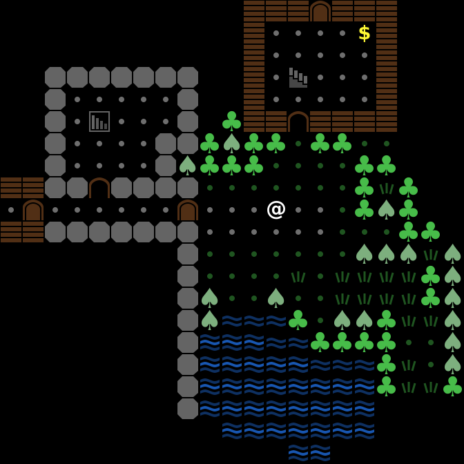
I wanted the interface to be more-or-less ASCII but maybe with some additions. I fired up Inkscape, a vector graphics editor, to draw a few different tiles, then used Tiled to create a map out of them. Then I added some more tiles (different kinds of walls, stairs…) and iterated on the design a few times:

As you can see, the concept moved away quite a bit from ASCII. One reason is that I wanted to have square tiles rather than rectangular. It feels more right to me to present the game world in a "uniform scale", so to speak. However, usually pure-ASCII square fonts don't look so well (and when you try to use the font for text, it becomes really bad).
Still, I tried to keep the symbols to be simple and instantly understandable. Minimalistic shapes, or universally recognized symbols. A few symbols (the trees, and of course @ and $) were taken from a font. The rest was surprisingly easy to draw! The graphics are vector based, but since the tiles are intended to be 32x32, I set up a suitable grid in Inkscape and made the shapes snap-to-grid.
And I'm still keeping @, letters for monsters, $ for gold and so on.
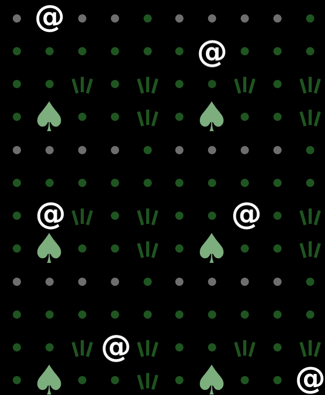
One thing I learned about ASCII and (ASCII-like) graphics is that black background is really important. I started out trying to have colored floors, with gray squares for the stone floor and green ones for grass. It didn't look good because there were sharp transitions between the squares. I could add some transitional tiles for "seams", but it meant a lot of additional work.
Instead, I went with the traditional ASCII solution, which is to have the floor be dots. Easy to implement, looks good, doesn't distract from the rest of the scene.
Prototype
Now that I had a mockup, making it come to life was pretty easy.
I did not want to use a heavy game engine that would make me follow some kind of architecture for everything from the start. I went with PixiJS. It's a pretty neat library that basically allows you to create a few new Sprite()s, add them to the scene, and throw everything at the screen.
Then I added movement. I always wanted to try animation in a roguelike - your movements can be quantified to full squares, but why not make the transitions smooth? To make it look better, I added alpha-blending to the tiles. If your character is standing somewhere, the ground tile below you should be hidden, and when you move, you can make the ground fade into view, and make the destination tile fade out at the same time.

Making it real-time
I originally wanted the game to be "real-time turn-based" with a turn happening every 1s or every 0.5s. This is how other multiplayer roguelikes (like TOMEnet and MAngband) work.
However, looking at my prototype, this felt really awkward. There was always an input lag after pressing a key, and what's worse, the lag felt random because it depended on when the turn is going to begin. So I decided to go the rest of the way to real-time and make the character respond immediately.
Now the game has a 60 FPS turn cycle. For each character, I have a "current action" field with information about timing. For example, for an attack animation that lasts for 3/4ths of a second:
player.action = {
  type: 'ATTACK',
  timeStart: now,
  timeEnd: now + 45,
  timeEffect: now + 13,
};
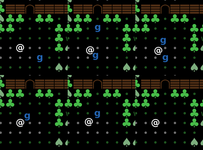
As you can see, there is a difference between time of the animation (timeEnd, after 45 frames) and time when the actual damage is applied (timeEffect, in 13 frames). The rest of the time is "cooldown", so that attacks cannot be repeated too fast. I animate it as a slow return of the attacker to the starting position:
